Introduction/Context:
I am working on a project that aims to develop machine learning models to predict brain states from electroencephalography data. By brain-states, I refer to co-activation patterns obtained from fMRI recordings (BOLD signal) during specific cognitive tasks (e.g., video viewing, Steady State Visual Evoked Potentials (SSVEP), etc.).
fMRI offers good spatial resolution but poor temporal resolution. On the other hand, electroencephalography provides great temporal resolution but very poor spatial resolution, as it only captures the brain’s electrical activity from the surface.
So the purpose is to obtain the same information from EEG as we have from fMRI. This is a very simplified way to put it.
The purpose of this post is to explain how and why I chose to animated my plots. Therefore, I will not delve deeply into details about data pre-processing, model training, feature selection, and the rationale behind these choices. These topics might be covered in another post.
The Data
Despite my intention to keep this post simple, I still need to provide some context about the data.
Subjects
We have a population of 22 subjects.
Brain States
- The brain states consist of 8 co-activation patterns (CAP) over time, forming a time series.
- Each subject has 8 brain-states.
The brain-states were resampled to a 3.8 Hz sampling rate.
Each subject has 8 time-series.
EEG Data
We have EEG dynamics over time for every frequency band from 1 Hz to 39 Hz, with 1 Hz increments. This dynamic is captured through 61 electrodes. Therefore, we have 61 * 39 = 2379 time-series per subject. The EEG data were resampled over time to match the brain-states time-series.
Data Organization
Data were organized into numpy arrays:
- Brain-states: 3D array of shape
(n_subjects, n_brain_states, n_time_points) - EEG: 4D array of shape
(n_subjects, n_electrodes, n_time_points, n_frequency_bands)
The Challenge
The data has been trained in a leave-one-out cross-validation manner. This means that for each subject, the model is trained on the remaining 21 subjects and then tested on the subject itself (Scikit Learn Cross Validation Leave One Out).
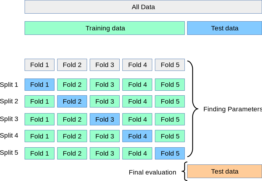
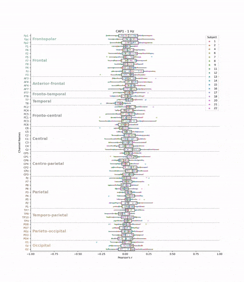
This cross-validation was performed for all subjects, each brain-state, each frequency band and each electrodes. We chose to evaluate the model’s performance by looking at the correlation between the predicted and real brain-states. We have 22 subjects, 8 brain-states, 39 frequency bands, and 61 electrodes. This means that we have 22 * 8 * 39 * 61 = 41,736 different correlations values. The challenge is to visualize these the correlations values (x-axis) for each subject, brain-state, frequency band, and electrode (y-axis) in a boxplot.
The Solution
Bruteforce
Let’s start with the brutforce solution which is to make a big PDF and plot the boxplots for each brainstate and frequency band pair. This would give us a PDF with 8 * 39 = 312 pages. This is not that bad: my managers would receive 1 PDF file instead of 312 individual png files! But let’s be honest, it’s not fun to scroll through the PDF.
Animate the plot!
The second solution is to animate the plot which has several advantages:
- It gives the opportunity to have a general view of the data in seconds.
- The UI video cursor can be used to navigate through the data.
- It is the optimal solution to export. We don’t need to recompute the figure at every cursor update (unlike other solutions such as using matplotlib cursor).
Here is the idea to plot and save the animation in a mp4 format:
import matplotlib.pyplot as plt
import pandas as pd
from matplotlib.animation import FuncAnimation

df = pd.read_csv("my_data.csv")

# I am creating a lists of tuple for all brainstate-frequency pairs in order
# to have a sort of indexing I can use to get data in the main dataframe df
df_freq_cap = list(df.groupby(['brainstate','frequency_Hz']).indices.keys())

# Changing the subject number into a category type in order to have each
# subject treated as individuals and be able to perform other operation in the
# future.
df['subject'] = df['subject'].astype('category')

# This function is on what `FuncAnimation` from matplotlib will rely upon.
# It is basically a function that plot only 1 case (the case n) meaning 1 frame.
#
def animate(cap_freq_pair_idx: int):
    frequency, cap = df_freq_cap.iloc[cap_freq_pair_idx]
    selection = df[(df['brainstate'] == cap) & (df['frequency_Hz'] == frequency)]
    plt.cla()
    sns.boxplot(data = selection,
            x = 'pearson_r',
            y = 'ch_name',
            fill = False,
            color = 'black',
            orient='h',
            whis=(0,100), # I am chosing the whisker to span from min (0%) to
                          # max (100%) values
            linewidth = 1,
            ax = ax,
            )

    # I am plotting individual subject here to see how each subject contribute
    # to the data distribution and if there are some consistent subject that
    # drive the data in one or the other direction.
    sns.stripplot(data = selection,
            x = 'pearson_r',
            y = 'ch_name',
            hue = 'subject',
            orient='h',
            ax = ax,
            )

    # It's better to hardcode the legend in a fixed position for 1) performance
    # and 2) consistancies (if you don't want a stroboscope of legends in your
    # animation!)
    plt.gca().get_legend().set_loc('upper right')
    plt.xlim(-1,1)
    plt.title(f'{cap} - {frequency} Hz')
    plt.axvline(0, color = 'grey', linewidth = 1, linestyle = '--')


fig, ax = plt.subplots(figsize = (13,15))

# Here is where the soup is made! We have all the ingredient defined in
# the function animate and the food processor `FuncAnimation` will do the job.
# Basically it will update `fig` with the figure generated by `animate` for
# every n cases. The `interval` means how long (in milliseconds) do you want
# to wait between each frames? And `frames` is the number of frame desired.
ani = FuncAnimation(fig, animate, interval=100, frames = len(df_freq_cap))
ani.save(f'animation_boxplot_custom_bands_{task}.mp4', writer='ffmpeg')
plt.show()
Result: